Mastering Technical Chart Types: Your Ultimate Guide
- Updated on : May 23, 2026
- 3855 Views
- by Arun Singh Tanwar

 Facebook
 Instagram
 Youtube
Overview
Before the internet and fancy charting tools, investors used to rely on basic stuff such as studying a company’s finances, checking the news, and networking with other stock market fellows to make informed decisions. Uff, a lot of work, right?
While these fundamentals remain crucial, technology has revolutionized the ability to track the heartbeat of the market. Thanks to cool charting tools, now we can track even the tiniest price movement.
In India, the most famous techniques of analyzing charts are candlestick and line charts. But hold on, the list doesn’t end here, there’s more to explore in the world of technical charts!
Let’s dive into some other types of charts that make understanding the stock market easier than ever.
Ready? Let’s go!
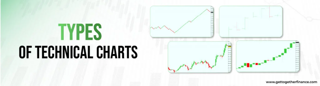
Types of Technical Charts
Charts show a visual graph of price fluctuations of securities over time. It doesn’t only tell the tale of price movements or current market trends, but lets investors track the major movements, significant historical events, and unravel the untold story of the market. It uses volume, time intervals, and historical price to plot the chart patterns.
Fun Fact: Technical analysts are also known as chartists. Originally, chartists used to draw charts manually, but a majority of charts are now generated by computer.
Among all the available charts, the names we know of and are popular are line chart, candlestick chart, bar chart. But investors around the world prefer and use other chart patterns too, depending on the need, to assess the technical movements of the market. They can also be presented on a logarithmic or arithmetic scale, based on the type of information investors want to gather. Here are the major chart patterns used worldwide explained in brief.
Candlestick Charts
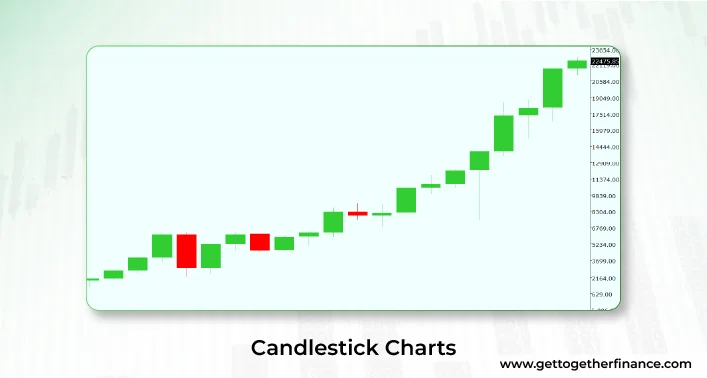
One of the most popular share market chart patterns – candlestick charts. Originated in Japan in the 18th century used for rice trading, the candlestick patterns have been the favorite charting technique among pro and beginner traders.
Each candle tells a story of opening, closing, lows and highs of the stock price. Crafted with two major elements – wick and body, it helps analyze short-term price movements and patterns. What makes it good among traders is its visually rich trait which helps them easily detect market sentiment using colors and shapes, showing the uptrend, downtrend, and sideways trends.
The color of candlestick represents the sentiment of buyers/sellers at a particular period of time (depending on candle timeframe). If it’s red, there has been a decline in the price and if it’s green – good day for traders. But what’s the white candle? Also known as ‘Open’ candlestick, it boasts the price has gone up.
In the trading world, professional traders/investors use multiple combinations of conventional candlestick patterns to identify market moods and price directions. It includes Hammer pattern, Engulfing pattern, Piercing Line pattern, Morning Star and Evening Star patterns, Harami pattern, Hanging Man, Three Black Crows pattern etc. Altogether, all these candles speak the story of market sentiment, price waves, and shifts in trader psychology over time.
Also Read: Tracking Stocks
Line Charts
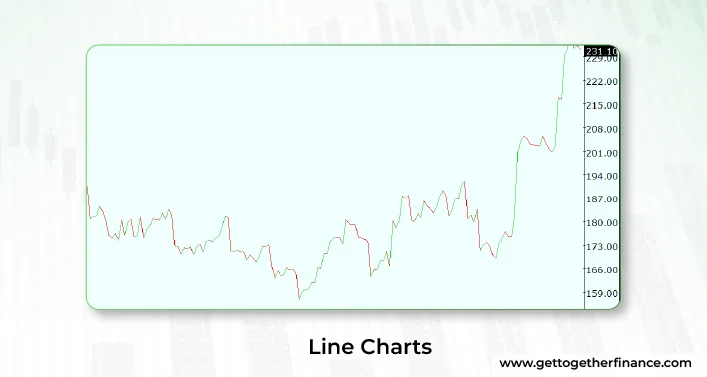
One of the oldest tricks played in the market. Line charts are one of the original and simplest chart patterns one can come across. Made of a single line, it gives a general idea of price movement and direction of the market. Line charts were used way back in the day to track basic price changes. Line charts show closing prices connected with the line. Easy to understand for beginners, it gives a quick overview of price trends over time. The main speciality of line charts is its simplicity in design – anyone can read a line, without any fuss, right?
Bar Chart
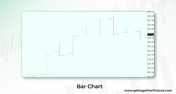
Also known as open-high-low-close (OHLC), the birth of bar charts can also be traced in the history of line charts, the origin. But the bar chart further started gaining popularity in the 20th century. Similar to the candlestick pattern, it shows all four elements – the opening, closing, high, and low of a stock price using bars for price data. Represented as a vertical line, the horizontal dash on the left shouts about the price opening and horizontal dash at the left speaks of the closing of the price. Traders use this pattern for detailed price movement analysis. Bar charts show price action with more detail than line charts.
Renko Chart
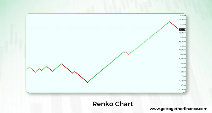
Also originated in Japan, it was used to track price movements in rice markets. The speciality of Renko chart is that it is a noise-less charting technique, focusing only on price movements, despite the time and volume usage. Chart includes white/green and black/red bricks, created on the basis of price rise or drop, not compared with previous bricks. If the price goes up, it makes the white/green brick and when the price drops, it leaves a black/red brick in the chart. Each brick (or block) represents a fixed price movement, disregarding time. Renko chart pattern helps traders identify trends more clearly by reducing minor price fluctuations, filtering out noise.
Heikin Ashi
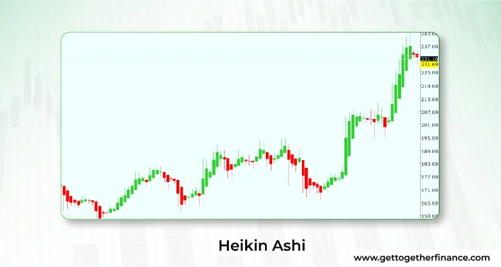
Looks like a candlestick chart, but hey, it’s not! Also originated in Japan, Heikin Ashi aims to smooth out price fluctuations and gives a clearer view of market trends. It uses averages of the last candlestick low, high, close, and open to measure the value of the current candle. The best part of Heikin Ashi charts is that it uses the average of the previous candle, offering smoothened price fluctuations. That means it can be independently used by swing traders, investors, or day traders. It can help traders/investors spot trends, even in the choppy market.
Point and Figure Charts
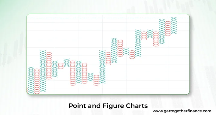
Wait, is that even a chart pattern? Yes, not very popular among traders, the point and figure charts weed out all the noise and use significant price movements to give an average. The history of its uses goes back to the late 19th century as the first and one of the oldest charting methods used by technical traders. The method only talks about the major price changes, ignoring time, using Xs and Os to show uptrend and downtrend respectively. It is used by average traders, especially beneficial for long-term trading.
In A Nutshell
Each chart type has its own story and strength to tell, helping traders in different ways to understand price movements and make better decisions. As a trader/investor, understanding the technicalities of different chart patterns can help traders select the most suitable chart type as per their preference and requirements at the moment. There are no charting techniques less useful, and always remember – people used to read markets without charts too so it’s never too bad.
FAQs
What are the technical chart types?
Technical charts are just different ways to show how stock prices move over time. It gives investors ease to understand what’s happening in the market. There are several different types of technical charts, including bar chart, line chart, candlestick chart, Heikin Ashi, Renko chart, and Point-and-Figure charts, etc.
Why are technical charts important for stock analysis?
Technical charts act like maps for the stock market, navigating the way of the market throughout the storm. They help traders. investors observe trends, patterns in price, and fluctuations in movements, helping in informed decision making about buying or selling stocks.
How do technical charts differ from fundamental analysis?
Fundamental and technical analysis go hand-in-hand. While fundamental analysis looks at the financial stuff of the company such as profits, debts, financial statements etc. On the other side, technical charts review price movement to figure out what might happen next.
What are the main components of a technical chart?
A technical chart is analyzed on the basis of multiple factors, including timeframes, price data, chart types, price fluctuations, and technical indicators.
How can a technical chart help spot trends in the stock market?
Assume a technical chart as a weather map for stocks. They help investors/traders if the price of stock is going up, down, or staying the same over the time.
Are there different types of technical chart patterns?
Yes, lots! Some look like triangles, some like flags, and others have funny names like head and shoulders. Each pattern tells us something different about where prices might go next.
How do Renko charts differ from traditional candlestick charts?
Renko charts aim to describe the big price changes and ignore the smaller ones. It can help us see trends more clearly without getting distracted by tiny movements.
What is the importance of Heikin Ashi charts in technical analysis?
Heikin Ashi charts smooth out price movement, giving an average of stock price. It makes trends easier to see, just like putting on glasses to see things more clearly in the stock market.
Can technical chart patterns be used for short-term trading strategies?
Absolutely! Many traders use chart patterns to identify quick opportunities in the market. Investors can also make short-term trades based on their observations. Some investors consider candlestick chart patterns a good way to review short-term price movement.