Chart Patterns
- April 27, 2024
- 6199 Views
- by Manaswi Agarwal

 Instagram
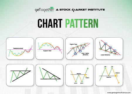
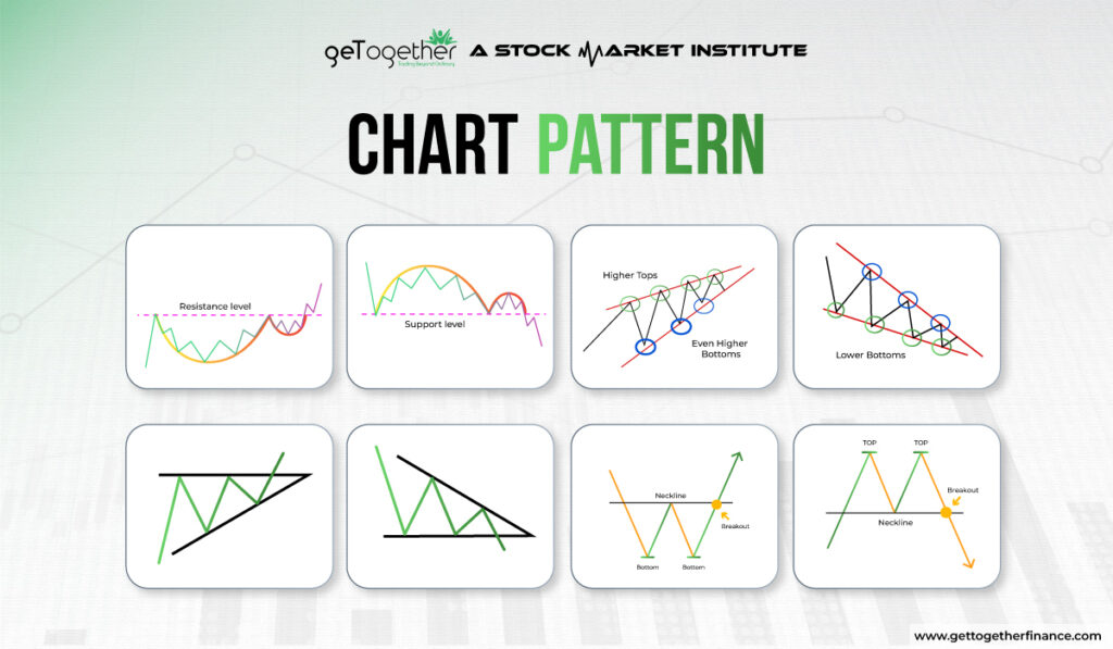
Chart Patterns are used by traders to conduct technical analysis which is beneficial to determine the prices of assets. The patterns are recognised as they form different shapes through which the behavior of buyers and sellers is predicted. It gives an idea about the trend and market movements.
Here are some essential chart patterns that are used in financial markets for trading.
Head and Shoulder Pattern
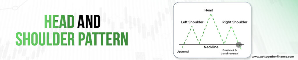
Head and Shoulder Chart pattern is formed after an uptrend that contains three consecutive successive peaks: middle one being at the top while the other two at the sides being almost equal. The two peaks at the sides are the shoulders that are formed on the neckline. The head is considered as the highest peak in the middle. The neckline or the support line connects the lows of each peak.
The neckline can have upward slope, downward slope or be horizontal. This slope of the neckline determines the degree of bearishness that the pattern has. The downward slope of the pattern is more bearish as compared to the upwards slope.
Double Top and Bottom Pattern
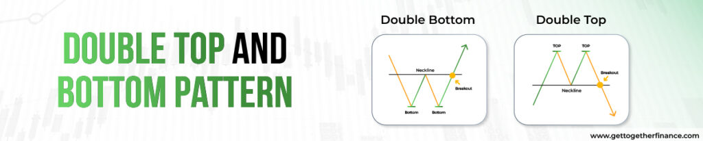
Double Top Pattern
Double Top chart pattern signifies a bearish reversal pattern which takes place after an uptrend in the market. The pattern can be represented by forming an “M” shape. The formation of this pattern implies that the selling pressure in the market is strengthening and that the trend will get reversed soon. The double top pattern contains two peaks which are roughly equal in height having a trough in between them. The pattern gets completed when the price breaks below the support level or the resistance level which got established during the trough.
Double Bottom Pattern
It is opposite to the double top pattern that depicts a bullish reversal pattern that takes place after a downtrend in the market. It can be seen as a formation of “W” representing two troughs at the sides with a peak in the middle. The pattern is completed when the price breaks the resistance level i.e the neckline which connects the two peaks between the troughs. This pattern signifies that the buying pressure is strengthening which might soon reverse the trend.
Cup and Handle Pattern
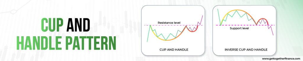
Cup and Handle chart pattern occurs during an uptrend in the market representing a bullish continuous pattern that excites the trader. The cup looks like a bowl which is “U” shaped where most of the time the two highs will be equal on both sides of the cup. After forming the shape of a curve, the price takes a downturn that represents the handle of a cup. The price breaks out from the handle which is then marked as a bullish trend in the asset.
Triangle Patterns
Here are 3 types of Triangle patterns, which traders use.
Ascending Triangle
Ascending chart pattern is a bullish pattern that helps the traders to identify potential trading opportunities. The two lines horizontal trendline and upwards-sloping trendline connect the series of price highs and a series of high lows respectively. Connecting these points represents a triangle with a flat top (horizontal trendline) and rising bottom (upward sloping trendline). An ascending triangle basically gives a signal to the traders so that they can take help of the breakout and enter into a long position by setting their stop losses which are below the horizontal support level. The pattern is followed when it breaks the horizontal resistance level with a continued uptrend in the market.
Descending Triangle
This pattern is opposite to the ascending triangle pattern as it represents the bearish trend that identifies various opportunities for the traders. It has a horizontal trendline and a downward sloping trendline which connects to the series of price lows and a series of lower highs respectively. The pattern looks like a descending triangle which consists of a flat bottom and a falling top. This pattern is said to be followed when it breaks down below the horizontal support continuing the downtrend till the apex of the triangle..
Symmetrical Triangle
When the price consolidates for some time and does not make a decision to move in a particular direction then the two trend lines drawn move towards each other forming an intersection point. The price moves sideways as a result of the consolidation phase This functioning results in forming a symmetrical triangle or a normal triangle pattern. This pattern helps traders to identify the period of indecision in the market where the buyers and sellers are almost equal. However, the breakout in the symmetrical triangle decides the continuous trend or reversal trend in the chart. The direction of the pattern can only be predicted after the occurrence of a breakout.
Wedges
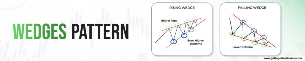
Wedges are formed between two sloping trend lines which can depict a rising as well as a falling movement. There are two types of wedges i.e. rising and falling.
Rising Wedge
The two trendlines with an upward movement with slanted lines of support and resistance represents a rising wedge. In a rising wedge, the price breaks down below the support level which indicates a bearish movement.
Falling Wedge
Falling Wedge is a downward slope that is wide on the top and contracts as it comes closer because of decreasing prices of the asset. Falling wedge is the reaction of high and lows that contacts as the price moves down. The two trend lines are formed on the highs and lows indicating a falling wedge. The price then breaks the resistance level in upward direction and hence gives a bullish phase to the pattern.
Both the patterns are reversal where the rising wedge represents a bearish market whereas the falling wedge represents a bullish market.
Also Read: Wedge Pattern
Limitations
Chart patterns such as head and shoulder, double top and double bottom, and wedges are quite popular which are used by many traders to determine the price action. These patterns lack authenticity because these are very easy to identify. Because of its wide usage, a trader or investor cannot completely rely on chart patterns and requires advanced technical analysis techniques like demand and supply theory for increased probability.
On a Final Note
Chart patterns can be helpful in trading but do not follow 100% accuracy which is why GTF follows its own “Demand and Supply Theory” for trading purposes which is much better and reliable. A trader must be familiar with these chart patterns as they are used in the financial market but should be dependent on his own research and analysis.
FAQ
Q1. How are charts formed?
Chart patterns describe the price movements over a period of time. These patterns help traders to identify and analyze the future market movements.
Q2. Can I rely on chart patterns for trade?
You should be able to conduct in depth analysis before completely relying on the chart patterns. While these patterns can help additionally to predict a bearish or a bullish market movement.
Q3. How do chart patterns work?
The chart patterns aim to provide you with insights about the breakout in a trend. After proper research about the chart patterns, investors can analyze the movement of price in an asset through breakouts or breakdowns.
Q4. What are wedges?
Wedges are the chart patterns formed between two sloping trend lines that indicates a rising as well as a falling movement.
Q5. How to identify a chart pattern?
Chart patterns are identified by the trend lines which are formed by joining the highs and lows of the prices.