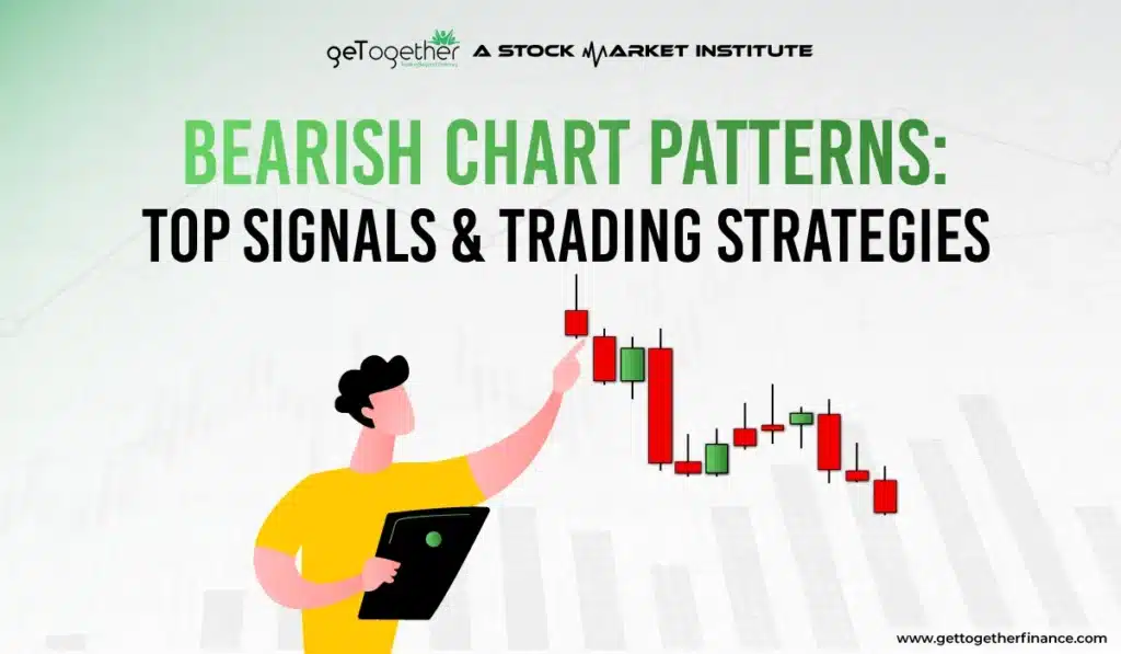
Bearish Chart Patterns: Types, Confirmation Signals & Trading Strategies
- Updated on : May 23, 2026
- 8017 Views
- by Arun Singh Tanwar

 Facebook
 Instagram
 Youtube
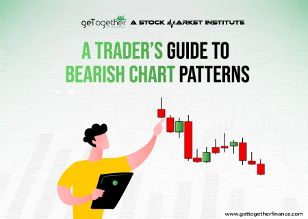
Overview
Bearish chart patterns in technical analysis help traders to identify when an upward price move may end, and when selling pressure is starting to rise. But what are these patterns? How can you remember them on the chart, and how reliable are they in trading? In this blog, we discuss commonly used bearish patterns, what they indicate, and how to use them properly alongside other tools, such as trend confirmation and volume. Whether you are a beginner or an experienced trader, the insight ahead helps you reduce false signals and trade smarter.
What is Bearish Chart Patterns?
Bearish chart patterns in technical analysis are price patterns that indicate a possible trend reversal to the downside or continuation of bearish momentum.
Studied mostly in technical analysis, bearish stock patterns often show a downfall or impending decline in the price of an asset, indices, or security. The signal boasts the upcoming selling pressure and a series of lower lows and lower highs in the price action.
Mostly such downfalls are followed by a good market consolidation or sideways when more and more sellers enter the market. This creates a bearish momentum, pressuring the continuous downfall further. Sometimes, you may find sharp decline or sell-off when the price is closing below the major support levels, moving averages, Fibonacci retracement, or trendines.
There are several bearish chart patterns that traders can familiarize themselves with to understand the market sentiment switch. Some may assume that knowing only bullish chart patterns are enough as bearish patterns are not worth your time.
Knowledge is never a waste and bearish stock patterns can be just as beneficial as bullish ones. In fact, in some scenarios, they may prove even more profitable if one knows what they’re doing.
A wise expert trader can profit from both sides of the market, and take advantage of the swings in either market direction.
Also Read : share market chart patterns
Bearish Chart Patterns
There is an eclectic bearish chart patterns range, used by expert or conventional traders or investors to understand the market and make informed decisions. Besides, some traders use several bearish candlestick patterns to detect the seller’s domination on the market.
All the range is classified into reversal and continuous pattern categories, the two types of chart patterns. Here we have listed all the bearish chart patterns that can be used to decode the potential bear hit on the stock market.
Let’s get into these without wasting a jiffy.
Inverse Cup and Handle
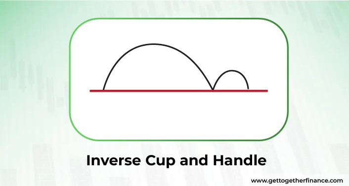
One of the commonly used reversal patterns in the bearish chart pattern used as technical indicator among pro traders. Imagine a cup with a handle on a chart, but it’s upside down, spilling the tea to trader’s about the next hottest gossip in the town. In this, the bowl is often inverted ‘U’ shaped with a price chart handle looking consistently downward to show what’s in its mind to its favorite traders.
The pattern occurs when the price goes up at the peak, but drops downward make an inverse ‘U’ shape on the chart. The price again tries to reach the previous peak but instead creates the form of a handle, telling traders that it might not go up again for a while. Inverse cup and handle pattern is one of the continuous bearish chart patterns that shows a breakdown. Mostly the cup and handle chart pattern is considered bullish but its twin inverse cup and handle looks forward to decline in the price.
Head & Shoulder Pattern
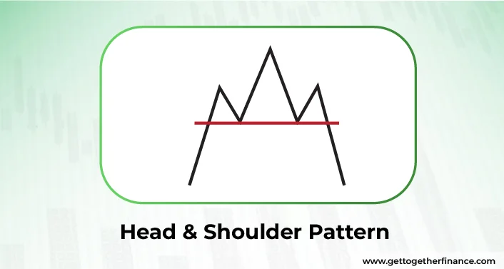
One of the commonly known reversal bearish chart patterns that shouts about the upcoming strong bear punch to the market. The chart shows the shape of a human head and two shoulders – just like the picture – which means it’s time for sellers to take over.
The whole game is played by ‘volume’ of buyers and sellers and during its peak, the volume of pending orders gets triggered in between. When the ‘left’ shoulder is created, more buyers try to get in sensing a potential upmove. And during the right shoulder, buyers sense the trend reversal. It’s a breakout that may lead price to price to a new low. The other variation, like a cousin, is inverse head and shoulder which depict the same traits but opposite outcome, reflecting a reversal of bullish chart behavior to its fans.
Double-Top
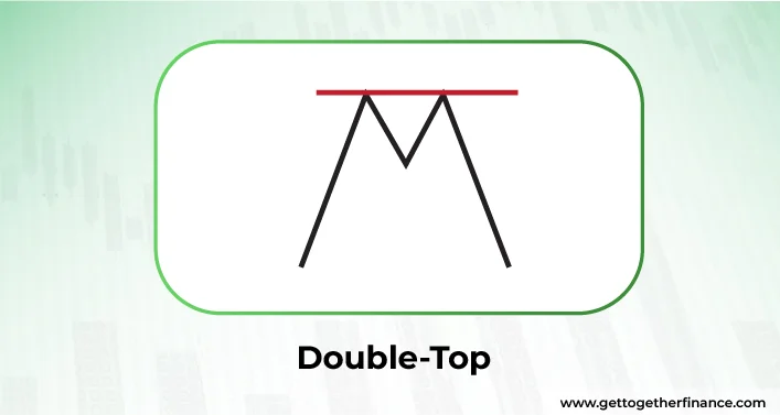
Double Top pattern is one of the classic bearish reversal patterns that roast two high peaks with a major fall of trend reversal in the price. In the process, the price will make two higher highs and higher lows on the charts. Mostly the double top pattern is studied on bar, line, and candlestick charts. It has a twin brother – Double Top Breakout that looks the same, walks the same but isn’t the same. Henceforth, it is recommended by experts that U=until the key support is broken, the real Double Top pattern can not be confirmed.
Also Read: Double Top v/s Double Bottom Pattern
Triple-Top
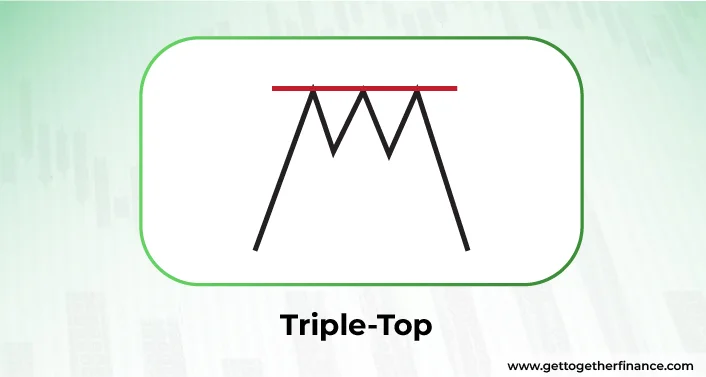
If the double top hasn’t got you a bearish reversal, you can try your luck with the Triple Top pattern. Mostly observed in line, bar and candlestick charts, the pictures create three high peaks, instead of two along with three high lower peaks, creating a strong resistance level. During the third peak, the sellers overpowers the buying pressure, torching a green light for bearish reversal fans.
Once you spot a breakout of price below the neckline or support line with significant volume, traders read it as a potential downtrend. For aggressive entry, put your entry below the broken support. But to make a conservative entry, wait for the price retest of the broken support line to hint at a confirmation of a downtrend. This is your clue to take a confirmation entry. For risk management, place a stop-loss order above the support line or neckline to limit potential losses.
Rising Wedge
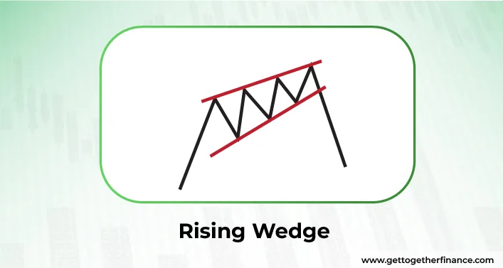
The Rising Wedge is also a Bearish Reversal Pattern that creates a shape of wedge – showing two converging trendlines. In this, the price goes higher giving an impression of continuous highs contracting in the shape of a symmetrical triangle. The slope closes at the end just to take Sharpe reverse in the movement and direction. In this, regardless of the type (continuation or reversal), the price acts only bearish.
The rising wedge can be one of the most complex chart patterns to decode and trade. Before entering and trading, it is important to confirm the pattern. When the price breaks below the lower trendlines of the wedge with significant volume. This shows an increasing number of overpowering sellers in the market. Keep your entry point just below the broken support line (lower trendline) and stop-loss just above the upper trendline, in case of fakeouts.
Descending Triangle
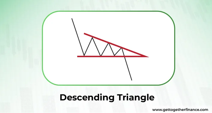
It’s time to break the bearish continuation pattern, as this formation is popular among conventional traders for its legendary support break. Also known as “falling triangles” in the stock world, descending triangles are complex to detect at an early stage.
It shows a bearish downtrend in the market with a series of lower resistance levels and lower highs. This creates a horizontal support line or trendline along with a slanting triangle at the resistance. In order to decode the right indicator of descending triangle, traders should check for minimum two lower and reaction high with constantly declining price with time. The process is often followed by downfall, upper trendline, trend continuation, and consolidation.
Bearish Flag
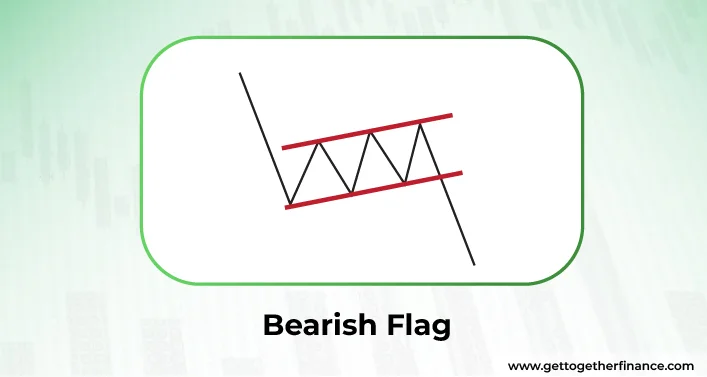
Bearish flag, slightly different from flag pattern, is counted as one of the continuous bearish chart patterns that shows a downtrend in price after a temporary pause. After a strong drop in the price, the price consolidates for a while, making a flag pattern.
The bearish pole and bearish flag pattern typically consist of two main parts: the flagpole and the flag itself. After a sharp decline in price, the market enters a consolidation phase, forming higher highs and higher lows. This sideways movement creates a parallel channel, known as the bearish flag, which gives sellers a pause before the price potentially continues its downward trend.
In simpler terms, after a big drop in price, the market takes a breather and trades sideways in a channel. This consolidation period allows sellers to catch their breath before potentially pushing the price even lower.
Bearish Pennant
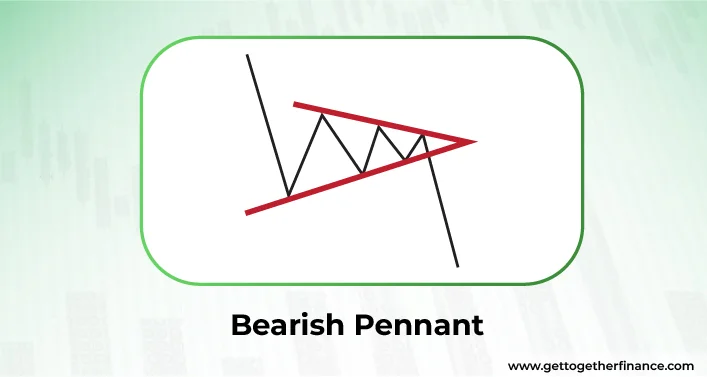
Bearish pennant or bear pennant shows a bear rushing toward the stocks for the continuous downfall, dropping its name into the category of continuous bearish chart pattern. It looks exactly like the bull flag but instead of pushing the price upward, it drops the price more downward.
Unlike the flag patterns that show price consolidation in parallel lines, bearish pennant shows price consolidation in covering lines until the breakout happens. It includes three major phases- a strong downfall, a period of consolidation, and a following downtrend.
The former phase commences when the seller pushes the price down, creating a series of lower lows and lower highs. In the second phase, the sellers take the back seat for a short period, making a triangle consolidation, where the price action moves between two converging lines. In the last phase, the consolidation phase leads to a downtrend with a breakout. Remember, before the breakout, the bear pennant remains in the ‘draft’ mode as the price might cheat on you and take a step back.
Symmetrical Triangle
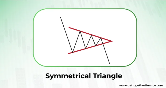
Also known as Coil, Wedge chart pattern, symmetrical triangle, often goes into the category of continuous bearish chart pattern. It contains at least two lower highs and two higher lows. It’s crucial for trendlines to converge at a roughly equal slope to make a symmetrical triangle. The pictures form a symmetrical triangle shaped consolidation with a following breakout or breakdown where the sellers win the fight and take over the market. Although history has evidently shown a trend reversal, more often symmetrical triangles mark the continuation of the current trend. Regardless of the trend, the final call of pattern confirmation can be announced after a valid breakout only.
Reliability of Popular Bearish Chart Patterns
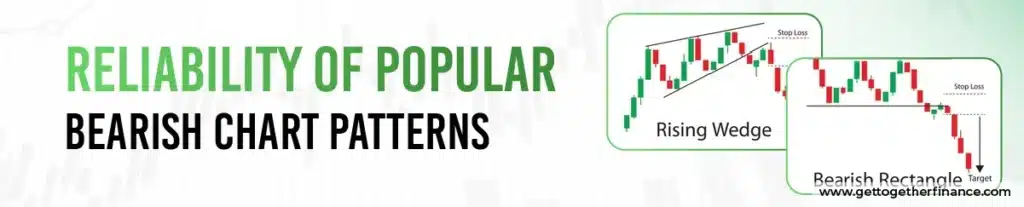
| Pattern | Reliability | Need Confirmation |
| Head & Shoulder | High | Yes |
| Double Top | Medium to High | Yes |
| Triple Top | High | Yes |
| Rising Wedge | Medium | Volume confirmation |
| Bearish Flag | Medium | Strong market trend required |
| Descending Triangle | Medium | Volume confirmation |
Key Insights: Bearish chart patterns become more trustworthy when price breakdowns occur with high trading volume.
When Bearish Chart Patterns Fail in Trading
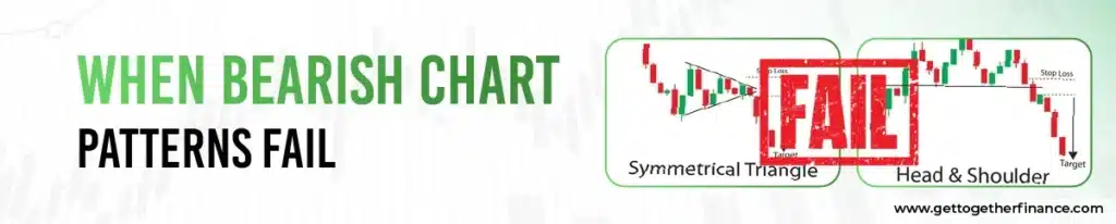
Bearish chart patterns fail during a powerful bullish market uptrend, when the market pushes the price higher. Also, they can give a false indication during weak-volume breakdown, because weak participation lowers reliability. News-driven price swings can avoid technical patterns and cause quick price surges. Patterns that form during range bound market have unclear directions and result in continuous decline.
Trader Psychology Behind Bearish Chart Patterns

Bearish chart patterns indicate a change in market sentiment where demands reduce its strength and sellers slowly dominate. After a strong rise, buyers start gaining profits while more people start selling at a high price level. When price fails to go high, investor sentiment decline which leads to a breakdown movement and a continued lower price. These patterns work because they show how market psychology and trader behaviour slowly change over time.
How Traders Use Bearish Chart Patterns in Practice
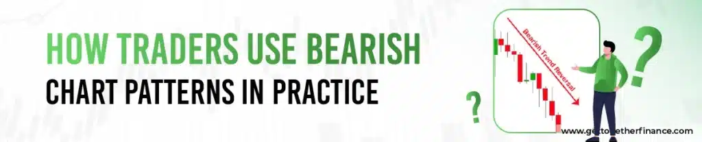
Understanding bearish chart patterns in technical analysis is one thing, but knowing how to actually trade them is different. Here is a step-by-step method that traders use to apply bearish chart patterns in market situations.
Step 1: Identify Prevailing Trend
Traders regularly check charts to identify in which direction the market is moving. They watch highs or lows to know whether the price is going up, down or remains the same.
Step 2: Spot the Bearish Structure Forming
Within this step, the trader spots the patterns that form a bearish chart. They look for:
- Descending triangles with lower highs.
- Bearish flags or pennants after a sharp decline.
- Double or triple tops at resistance.
- Rising wedges with converging trendlines.
- Head and shoulder patterns with three clear peaks.
Step 3: Wait for Breakdown Confirmation
The trader always waits for the pattern to be confirmed. They ensure that the price breaks through the trendline, neckline, or support.
Step 4: Enter below the Support or Neckline
Aggressive entry and conservative entry are the two methods that traders use to enter below the neckline or support. In aggressive entry, traders enter immediately when the breakdown candle closes. In a conservative entry, the trader waits for the price to bounce back up to the broken support level. When it can’t break back above and starts declining again, that’s where traders enter.
Step 5: Place a stop above the Invalidation
Every trader requires a stop-loss and places it above the invalidation to manage risk effectively. In a head-and-shoulder pattern, traders place a stop-loss just above the right shoulder or neckline.
Key Insights: Managing the risk is as essential as identifying the pattern
Do Bearish Chart Patterns Work Across Markets?

Yes, bearish chart patterns work across different markets, but they perform distinctly based on how structured and volatile each market is.
Stocks:
Bearish chart patterns work better in stocks, mainly when volume supports the pattern. High volume during breakdowns confirms the strength of the pattern and boosts its reliability.
Crypto:
In crypto, bearish patterns fail repeatedly because prices fluctuate too quickly. They work well when combined with price momentum indicators, such as MACD or RSI, to avoid false breakouts.
Forex:
In forex, bearish patterns perform better on higher timeframes like 4H, daily, or weekly. Lower timeframes create noise while higher timeframes offer clear and most trustworthy signals.
Key Takeaway: Bearish chart patterns apply to all markets, but traders have to adjust their strategy according to each market’s behaviour to get a steady outcome.
Limitation of Bearish Chart Patterns

Bearish chart patterns are a type of conventional technical analysis method. However, their major drawback is their credibility and reliability, particularly in accurately predicting trade entry points.
One major concern is the occurrence of fake breakouts, where the price briefly moves beyond a key level but then reverses. Such circumstances can lead to losses for traders who depend solely on chart patterns for their trading decisions.
To address this issue, expert traders recommend tandem in chart patterns with other profound technical concepts, such as demand-and-supply dynamics. Demand and supply zones, for instance, highlight levels where buying or selling pressure is likely to be strong, offering valuable insights into potential price movements.
By teaming demand-and-supply dynamics with bearish conventional patterns, traders can enhance their ability to forecast the expected price direction and detect a fakeout before it traps traders.
In a Nutshell
In essence, bullish and bearish both chart patterns are conventional ways of technical analysis of the stock market. Although they come handy and are the most common ways to identify the stock market moods, history holds the evidence of fakeouts or pattern failures, leading to loss of not only money but trust – it hurts. The only way to stay one step ahead in technical analysis is to equip your research with multiple foolproof, practical theories such as demand and supply, moving averages, trendlines, etc. Better think twice than lose it all.
FAQs
What are bearish chart patterns?
As the name suggests, bearish chart patterns are the shape or visual graphic presentation of price action on stock charts that suggest a decline in the price. They help traders predict when a stock might fall in value and sellers dominate buyers. Basically, it helps you understand the most asked question – what might happen next?
How can I identify bearish chart patterns?
That’s a simple task that gets as tricker as it forms. What you need is to look for bearish shapes like head and shoulders or double tops on the stock charts. These patterns show that the stock price might start dropping.
Which type of stock bearish pattern should a trader focus on?
The right answer is both! A trader should not miss both reversal or continuous patterns to book the potential benefit by trading correctly. However, keep your trading strategy robust and keep a different risk-reward ratio based on the type of bearish chart pattern.
What do bearish chart patterns indicate?
Bearish chart patterns show that the stock price might go down and. It’s like a warning signs for traders to be careful.
Are there different types of bearish chart patterns?
Yes, there are many types of bearish patterns, like head and shoulders, double tops, and descending triangles, etc. Each one tells traders something slightly different about the stock.
How reliable are bearish chart patterns in predicting market trends
Chart patterns are conventional ways of technical analysis of the stock market. They are not always perfect, but they can give traders a good idea of what might happen next. It’s like looking at the weather forecast—it’s not always right, but it helps you prepare.
Can bearish chart patterns be used in conjunction with other analysis techniques?
Yes, many traders use them with other techniques to get a clearer picture of what might happen next in the market.
How should I adjust my trading strategy when I identify a bearish chart pattern?
Adjusting trading strategy completely depends on your current market strategy, reliability of your pattern study, and preference. Many traders use these patterns as a signal to sell or avoid buying more of that stock. It’s like being cautious when you see a red light while driving.
How to Profit from trading bear market patterns?
Although most traders consider bullish chart patterns more profitable, it is true that bearish chart patterns can make more money relatively, if executed with proper strategy and research. To make money using bear market patterns, learn to spot significant bearish patterns, confirm them with technical indicators, set entry, exit, and stop loss points carefully while managing risk.
Is an inverted cup and handle bearish or bullish?
Inverted cup and handle speaks the tale of bearish waves in the market. It initially gives the impression of price upmove, just to drop back further more and more. This is an often observed chart pattern in the market and can be proven beneficial for those who can enjoy bullish vibes even in bearish waves.
Can I use bearish chart patterns for short-term trading?
Yes, many traders use these conventional chart patterns to make quick and informed decisions about buying or selling stocks in the short term. There are cases of pattern takeouts too, hence, it’s crucial to be completely sure before relying on the conventional pattern. Always complement your theory with profound techniques such as demand-and-supply, moving averages, etc.
How can one differentiate between a bearish chart pattern and a temporary price fluctuation?
A bearish chart pattern is a more long-term signal. On the other side, a temporary fluctuation is usually just a short-term blip on the chart. You have to keep observation and wait till you Peter Tingle says to jump in and take the action.