ART OF TRADING SETUP: A LADDER TO SUCCESS
- Updated on : May 23, 2026
- 4633 Views
- by Arun Singh Tanwar

 Facebook
 Instagram
 Youtube
Overview
Trading setup can be an alien word to some of you but a must and an important term for a trader. And if you are already here, it’s safe to assume you are familiar with stock market basics such as how it works. What are the essentials? But do you know how to carry out a trade? For sure, the stock market is a volatile place; you can’t certainly expect all the profit to come your way, but a good trading setup can increase the probability of a profitable trade.
What is Trading Setup?
A trading setup is nothing but a recipe to make a trade successful, a plan that tells you what to look for, when to buy, when to sell, and how much to risk. It is a particular arrangement of indicators, stock market chart patterns, and strategies which helps traders in the identification of Potential Entry and Potential Exit positions in the stock market.
What is the need for Trading Setup?
You need a proper systematic trading setup to maximize your chances of profit in your trade, analyzing the market properly and setting up a systematic trading setup leads to disciplined trading which basically increases the probability of successful trading by making the trade successful.
Trading Setup Basics
First and foremost in trading setup is to identify what suits you, day trading, swing trading, scalping, or investing. If you are an investor and want to enjoy long-term benefits then you should study the market or company by Fundamental analysis which involves studying a company’s financial statements, like balance sheets and earning reports in order to understand its potential for gain and growth.
But if you are a trader and interested in day trading, swing trading, and scalping then you should study the market by technical analysis. Where you study a stock’s behavior by analyzing its price chart and chart patterns. It focuses on previous price movements to predict future trends and help in making trading decisions.
Intraday Trading:-
in Intraday trading, a trader buys and sells securities or stock on the same day. Their goal is to get profit from short-term price movement that happens in a single day. That’s why they execute many trades throughout the day to take advantage of small price changes.
Swing Trading:-
in this kind of trading, traders tend to catch the profit over a longer timeframe, days to weeks. They tend to hold their position overnight and analyze price charts and patterns using technical analysis to find the potential trading setup. Their goal is to gain benefits from short to medium-term price fluctuation often seeking larger price moves as compared to day traders. Both strategies have their own fair share of risks, and risk management and depends on an analysis of price pattern, but differ in timeframe and approach towards trading.
Scalping:-
Scalping is a referral to an intraday trading strategy in which traders tend to get benefits from rapid and minute price movement. In order to get the benefit, the trader sits on the position for seconds, minutes, or hours and then liquifies it. Traders tend to scalp minute rapid movement of stocks.
Investing:-
investing is different from trading. Trading comes under technical analysis whereas investing comes under fundamental analysis. Where investors put money into something, like funds, or stock in the hope of greater ROI (Return Of Investment) Later in life. They use these investments to achieve their goals like paying for education, Saving for retirement or just to grow their wealth over time.
What are the different types of Trading Setups?
As there are various types of trading setup/ chart patterns but here we are, discussing a few of them:-
Demand and Supply:
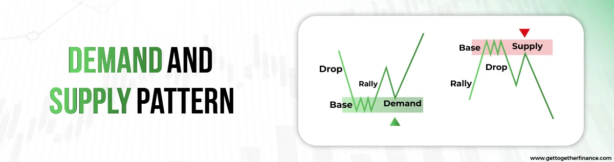
Demand and Supply is the key ingredient of a trading setup and technical analysis. Which is based on the Holey law of demand and supply that explains the relationship between the availability of a product and the desire for a product. generally, less availability and high demand tend to raise the price of a product, and high availability and less demand reduce the price of a product.
For example, in Covid 19 – prices of face masks skyrocketed due to high demand and less availability. A mere 10-25 rs mask was getting sold out at thrice its original value. Just like that, prices navigate in the stock market through demand and supply zones. where institutional pending orders for buying reside in the demand zone and institutional pending orders of selling reside in the supply zone. Whenever prices come down to these areas or zones, execution of excessive demand orders or supply orders would take place. Which will result in the up-move or down-move of the price.
Triangle Patterns:
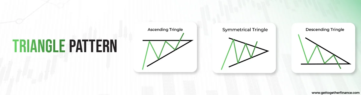
A triangle chart pattern showcases three variants: ascending, symmetrical, and descending. In an ascending triangle, stock price movement constricts between ascending support and a consistent resistance level. At the same time, the exact opposite can be seen in descending triangles where price movement is constricted between descending resistance and a consistent support level. On the other hand, a symmetrical pattern can be seen when stock price movement is restricted between both ascending support and descending resistance lines which results in creating a balanced triangular chart pattern on the chart, encouraging traders to take entry into positions after the pattern breaks from either side, using breakout trading strategies.
Head and Shoulder and Inverse Head and Shoulder Pattern:
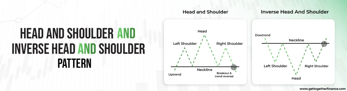
The head and shoulders pattern is a candlestick chart pattern that indicates a potential trend reversal. It consists of three peaks: a higher peak (the head) between two lower peaks (the shoulders). all supported by the neckline formed at the support zone. The pattern suggests a shift from an uptrend to a downtrend and is used by traders to make predictions about future price movements.
The inverse head and shoulders pattern also indicates a potential trend reversal. Similar to the H&S chart pattern it consists of three peaks: a higher peak (the head) between two lower peaks (the shoulders), but all this in an inverted way. These all are supported by the neckline made at the resistance zone. The pattern suggests a shift from a downtrend to an uptrend and is used by traders to make predictions about future price movements.
Double Bottom and Top Pattern:
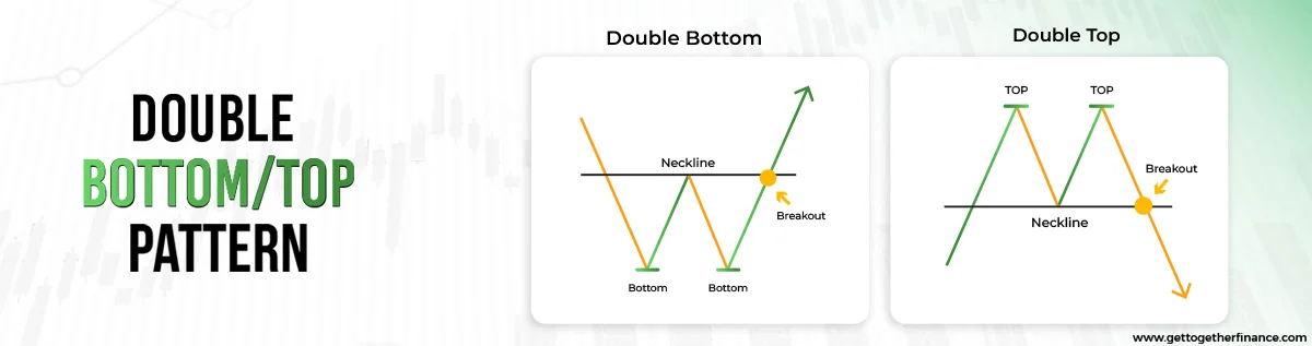
A double bottom pattern can be witnessed after continuous lows or downtrends where two bottoms would be seen in the support zone or demand zone at the same price leading to the formation of a reversal pattern, giving traders the opportunity of buying the stock. On the other hand, a double-top pattern is the exact opposite of double bottom. Where two highs can be observed after continuous highs or uptrends at the same price. This tends to create pressure on traders as this indicates the downfall of the stock.
Rectangle and Flag Pattern:
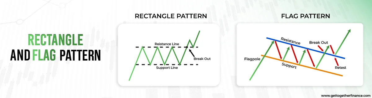
A rectangle chart pattern can be witnessed when the stock price movement is within a consistent price range. The movement of stock prices is constricted between supply zones known as resistance, and demand zones, known as support areas. By studying the movement of stock, the price usually breaks out of the range either from the support or resistance zone.
An almost similar pattern of rectangle is spotted but with a flagpole known as a Flag chart Pattern which can be seen when a stock price moves within a consistent range of highs and lows, creating a flag-like shape on the chart. It Starts with the Formation of the flagpole, which consists of either consecutive highs or consecutive lows and subsequent flag formation.
Cup and Handle / Inverse Cup and Handle Pattern:
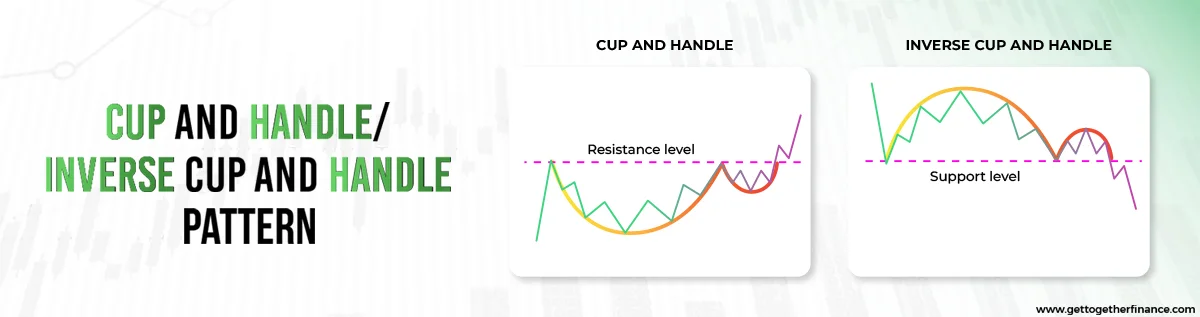
The cup and handle chart pattern is a bullish continuation pattern, on a security’s price chart. It resembles the shape of a “U” for the cup with a slightly downward-drifting handle. Being a bullish sign it exhibits an uptrend for a good period of time and helps in identifying favourable long positions. Traders who want to benefit from this chart pattern should position themselves with an entry marginally above the upper trendline of the handle segment.
Just like cup and handle, there is an Inverse Cup and Handle which is a bearish reversal chart pattern that is present at the end of an uptrend chart. It is also known as the inverted cup and handle pattern because when the stock price falls down after reaching a peak it forms an upside-down cup shape and goes back to near the previous high before falling down again. It is a sort of short-term bearish reversal pattern that depicts the breakdown below the support.
Wedges ( Rising/Falling ):
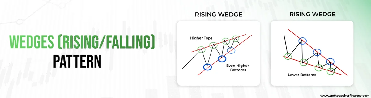
A wedge chart pattern is marked by converging trend lines on the price chart which are drawn to connect the highs and lows of a series of price movements
Lines which are appearing either high or low are either rising or falling at different rates, giving the impression of a wedge as the lines approach convergence. It can depict both bullish or bearish price reversals. There are two forms of the wedge pattern: Rising wedge(bearish reversal) and Falling wedge (bullish reversal).
The rising wedge pattern usually can be seen in the uptrend. It arises when the trade volume slows down a bit in both selling and buying. As a result, the convergence pattern is formed at the end i.e., This chart pattern is formed when two lines appear to meet at a common point. Furthermore, the breakout point comes at the end of convergence which signals the reversal downtrend. Hence, the rising wedge can be seen as a bearish reversal indicator.
The falling wedge chart pattern usually can be seen in the downtrend. It arises when the trade volume slows down a bit in both selling and buying. As a result, the convergence pattern is formed at the end. This chart pattern is formed when two lines appear to meet at a common point. Furthermore, the breakout point comes at the end of convergence which signals the reversal uptrend. Hence, the falling wedge can be seen as a bullish reversal indicator.
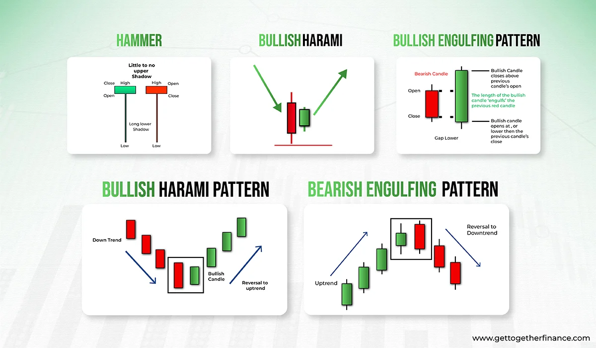
Candlestick Chart Patterns:
candlestick chart pattern is the visual representation of stock price movement in the stock market. These candlestick patterns are formed by the arrangement of candlesticks on a price chart. Each candlestick consists of a specific timeframe, opening, closing of stock, and low price of a stock. Although there are “n” no. of candlesticks patterns ( bullish candlestick patterns and bearish candlestick patterns ) here, we are discussing a few of them:-
1. Hammer:
The hammer pattern can be advantageous to the trader when seen at the support zone. A hammer pattern can be witnessed when the lower wick of the candle is longer than the body, creating an illustration of the shape of a hammer. It also denotes the buying pressure on the trader, however, it also gives the indication that the downtrend is likely to end and the price of the stock may shoot up now.
2. Bullish Harami:
Bullish harami candlestick pattern indicates the reversal trend in the stock market, where a small green candle is formed after a continuous downtrend of red candles. This is taken as an advantage of the trader, as they can take entry into the trade because the price is predicted to go high after this pattern.
3. Bullish Engulfing:
it is the most significant candlestick pattern under technical analysis. Which is formed when the green candle totally overshadows or engulfs the red candle from up to down. Usually, this is seen after the continuation of the red candle for a good period of time. A break in the downtrend and the start of the uptrend is confirmed by the formation of a bullish engulfing candle.
4. Bearish Harami:
Candlestick pattern which shows a reversal of a bullish trend is known as bearish harami. Where the formation of red candles occurs after a continuous uptrend. Here, the newly formed red candle will be smaller than the previous green candle, pointing out the reversal trend in the stock movement. Bears take advantage of these candlestick patterns and take entry into the trades, as the stock price is predicted to go down after this pattern. Traders earn profit in a bearish harami pattern by selling the stock at the start of the downtrend and buying the stock at the end after making a profit in the whole trade.
5. Bearish Engulfing:
Bearish Engulfing is one of the most significant bearish candlestick patterns in technical analysis. It can be seen when a red candle totally engulfs or overshadows the older green candle entirely. Usually, it occurs after the continuation of green candles, the emergence of the bearish engulfing candle shows the break in an uptrend and the start of a new downtrend. The trader’s entry at this point spikes the selling pressure which later leads to the downward movement of the stock.
Conclusion
Summing up all together, a well-defined trading plan is a must for successful trading. By strategizing a clear entry and exit, strive to capitalise on favourable market conditions while looking at potential risks. By following and incorporating these highlighted steps and these principles in their trading plan, one can enhance their profit while minimizing their potential loss.
FAQs
1. What is a trading setup?
A trading setup is an arrangement of indicators, chart pattern, and strategies which helps traders in the identification of Potential Entry and Potential Exit positions in the stock market. To maximize your chances of profit in your trade.
2. How to establish a trading setup?
Firstly know the basics about the trading setup by, trying and identifying what you are (day trader, swing trader, or investor) and how you are going to study the market by, Fundamental analysis Or by Technical analysis. After all these steps try to study the market and follow the strategy listed above.
3. What are the different types of Trading setups?
Some of the famous trading setups are as follows:
Demand and Supply, conventional chart pattern(Triangle, Head and Shoulder, Double bottom/top, rectangle, cup and handle), candlestick chart pattern(Bearish harami, bearish engulfing, Bullish harami, Bullish engulfing, and hammer ).
You can also checkout our blog on Breakout Trading Strategies which are often used by traders to get better results.